About the Client

Captura Biopharma is researching a formula that could revolutionize treatment options for individuals exposed to nuclear radiation. While current treatment options can only be administered through IV, their veteran team is developing a revolutionary alternative that can be taken orally.
Project Scope
Captura had a website, but it focused on scientific literature rather than usability. Our job? Make the mission and complexities of Captura’s work accessible and digestible to potential investors. The logo and branding needed to be updated to reflect the intellect backing this research. After a quick crash-course in decorporation agents and bioavailability, we got to work.
Logo & Style Guide
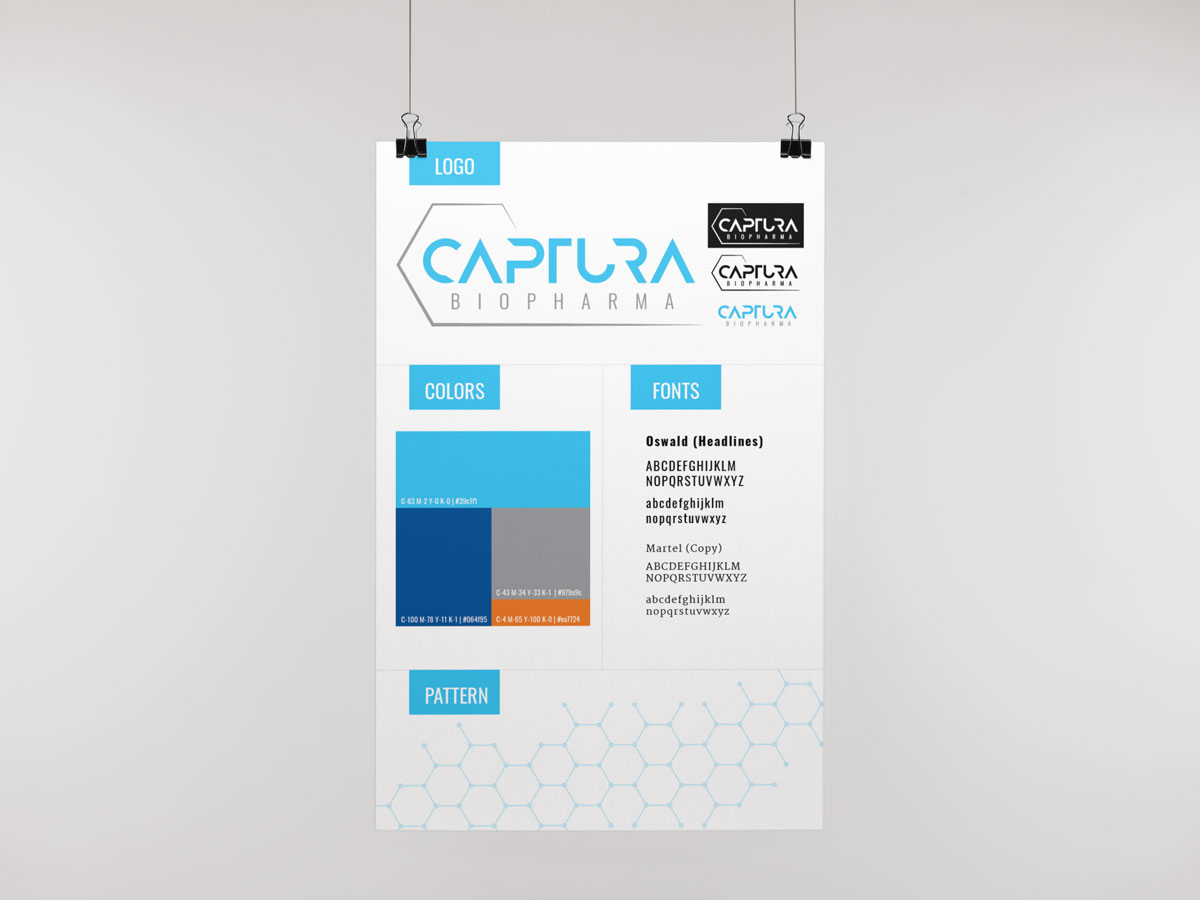
We rebranded Captura Biopharma with a logo inspired by the molecular structure. The thin lines and hexagonal shape reflect the futuristic nature of the solutions being developed by this team. Blue is clean and pure - the treatment Captura is researching cleans and purifies the body of toxins. Modern, clear fonts help to simplify complex concepts.

Web Design & Development
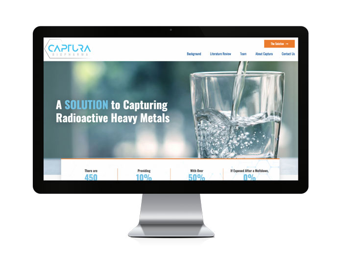
The Captura Biopharma website needs to convey a lot of information, and the old site lacked organization and readability. The new design reorders information into digestible facts and orderly pages that flow intuitively to guide the users experience. The bright, segmented pages allow you to read from one point to the next while still absorbing the details of the project and product.

