It’s amazing how some companies, both big and small, neglect their brand without even realizing it. From business cards with a logo that was replaced years ago, to an annual company letter using vastly different letterheads for consecutive years, we’ve seen it all. A lack of brand consistency can make you look sloppy, and can even cause some consumers/clients to question your company’s professionalism.
To avoid this issue and assist our clients in maintaining a clean, overall brand presence, we empower them with what we call a style guide. It is something that every company, regardless of size or industry, needs. Simply put, our style guides provide clients with the do’s and don’ts of their brand. They can be used for internal reference or given to any printing or sign company, leaving them no gray areas or questions on how to portray your brand.
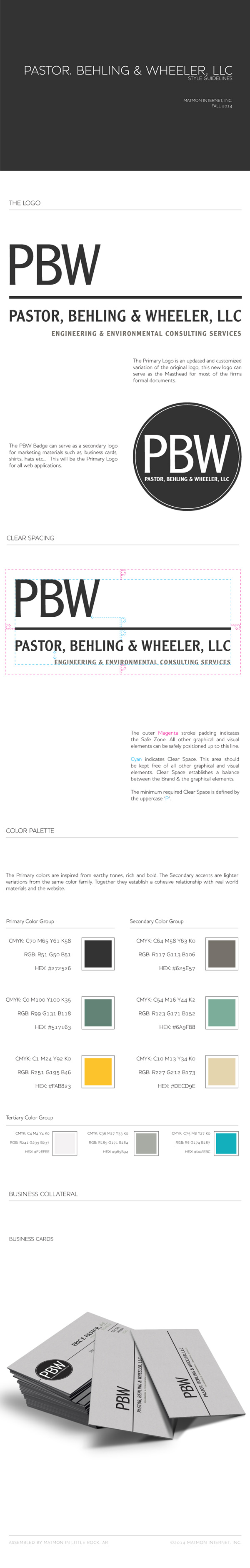
So now let’s think about your company. Do you lack brand consistency? Do you experience difficulties with printing companies or organizations presenting your brand inaccurately? A style guide from Matmon is the solution you need. Check out an example of one of our style guides below. We’d love to provide your brand with the consistency it needs.