When designing a website there are many different factors to keep in mind. One of these factors is how users are viewing your site. They all need a device that can access the Internet and a browser. A website will display differently on Internet Explorer than on Google Chrome, and different on a Windows computer than on an iPhone.
Creating a site compatible with all devices can be quite a hassle for web designers and for web developers. In the past the majority of visitors were on a Windows computer using Internet Explorer or Firefox with a screen resolution of 800 x 600. But today, monitors can have a screen resolution as high as 2560 wide and as low as 320*480 on a Smartphone; Internet Explorer is used on a minority of devices and there are at least 4 common operating systems.
The study
Matmon conducted a study of some of its highest traffic site in different industries and compared them to the statistics available online. We analyzed the operating system, browser and screen resolution per site and per industry.
Here is the industry breakdown along with the median of several July 2011 usage reports. The first thing we can see is that the average we found on our sites is different than the average statistics found online. The reason for this difference is the fact that most of our traffic comes from Arkansas, which is not representative of the world. This is why it’s important to study the analytics for your site and not trust average national numbers.
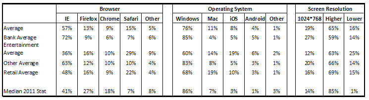
When broken down by industry, we can see the banking sites receive a more traditional type of traffic, whereas our entertainment and retail sites have a more eclectic traffic. Most of the users on the banking sites use Internet Explorer (72%) on a Windows machine (85%) with a screen resolution of 1024*768 or above (86%). For these sites, it will be extremely important to make sure the functionalities used are compatible with Internet Explorer. HTML5 and CSS3 still have many features that are not available on Internet Explorer, so do not get too fancy with those banking sites!
On the other hand, the traffic to sites in the entertainment industry does not have any major characteristics, only 36% use Internet Explorer which is not much more than Safari (29%). 25% of the traffic comes from mobile sites with 19% from iOS and 6% from Android. 25% also have a screen resolution inferior to the common website size of 1024px wide, once again due to mobile phone traffic. If 19% of users will not be able to read Adobe Flash, why do most restaurant websites still use Flash? It’s officially time to retire show food slideshow.
Some advice to get from this website analytics study
- Resolutions are getting higher. Gone are the days of 800*600 screens, in all the sites we surveyed more than 50% of the users had a resolution above 1024px and it’s going to keep on getting higher. Designers are letting go of the 960 grid for the 1140 grid, a grid that looks great on large resolution and that adapts to the browser on smaller resolutions.

The image above is a screen capture of a 800* wide website seen on a 2560*1440 screen.
- The web is becoming mobile. Most websites are going to need either a mobile version of their site, or a mobile compatible site (like the 1140 grid). Designers also need to keep in mind Flash does not work on Apple devices, and you cannot mouse-over with mobile browsers.

This is Matmon’s Our Work page viewed on iPhone. It has automatically been resized and reorganized to be easily readable and accessible on a small screen.
- Firefox, Safari, and Chrome are more and more common. Designers can get more creative with the use of HTML5 and CSS3 because most users will be able to see the results. Make sure there is an alternative for users browsing with Internet Explorer.
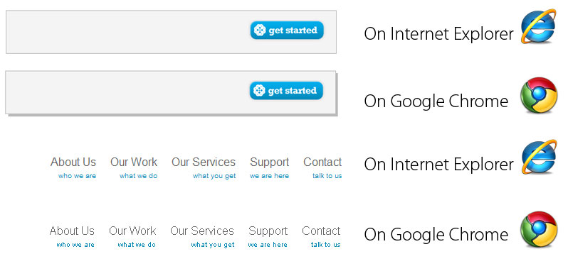
Some of Matmon’s features seen on different browsers: Internet Explorer and Google Chrome
- Who your customer is matters. A hype restaurant does not see the same traffic as an insurance website. Understand who your visitors are, what setup they are most likely to have and optimize your website according to that. We said most website would need a mobile site, but if you are like one of our site that sees only 3% of its traffic on mobiles, with 81% of visitors using Internet Explorer, it might be more valuable to invest in SEO rather than in a mobile site.
- Read, study and understand your analytics. They will help you better target your website for your users.
